Supporting a small upstart product team at Dyson over three months to improve the usability and scalability of PVBoM – an internal tool that helps Design Engineers analyse production and manufacturing costs.
My role was to introduce core UX thinking for a critical business tool that – while technically robust – struggled with usability and long-term scalability. My work ultimately helped shape the future roadmap and raised awareness of UX within a team that had been mostly engineering and data-led.
Key Challenges & Solutions
Challenge 1 - Low UX Maturity
The team was technically focused and had minimal prior exposure to user-centred design practices. Rather than focus on deliverables, I framed my contribution largely around design coaching — hoping to define a set of UX pillars or principles that could be used to evolve the design without my direct involvement.
⛳️ Goal
Introduce solid UX principles to guide decisions around future design and development work, even after my involvement ended
Approach
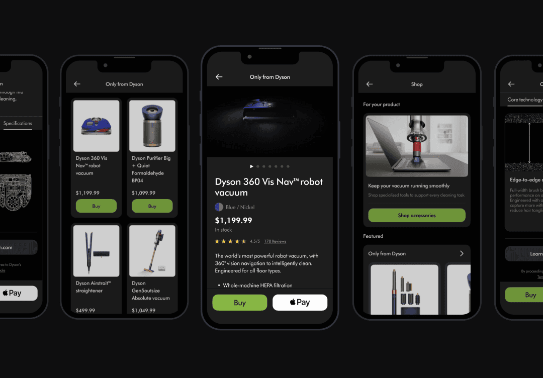
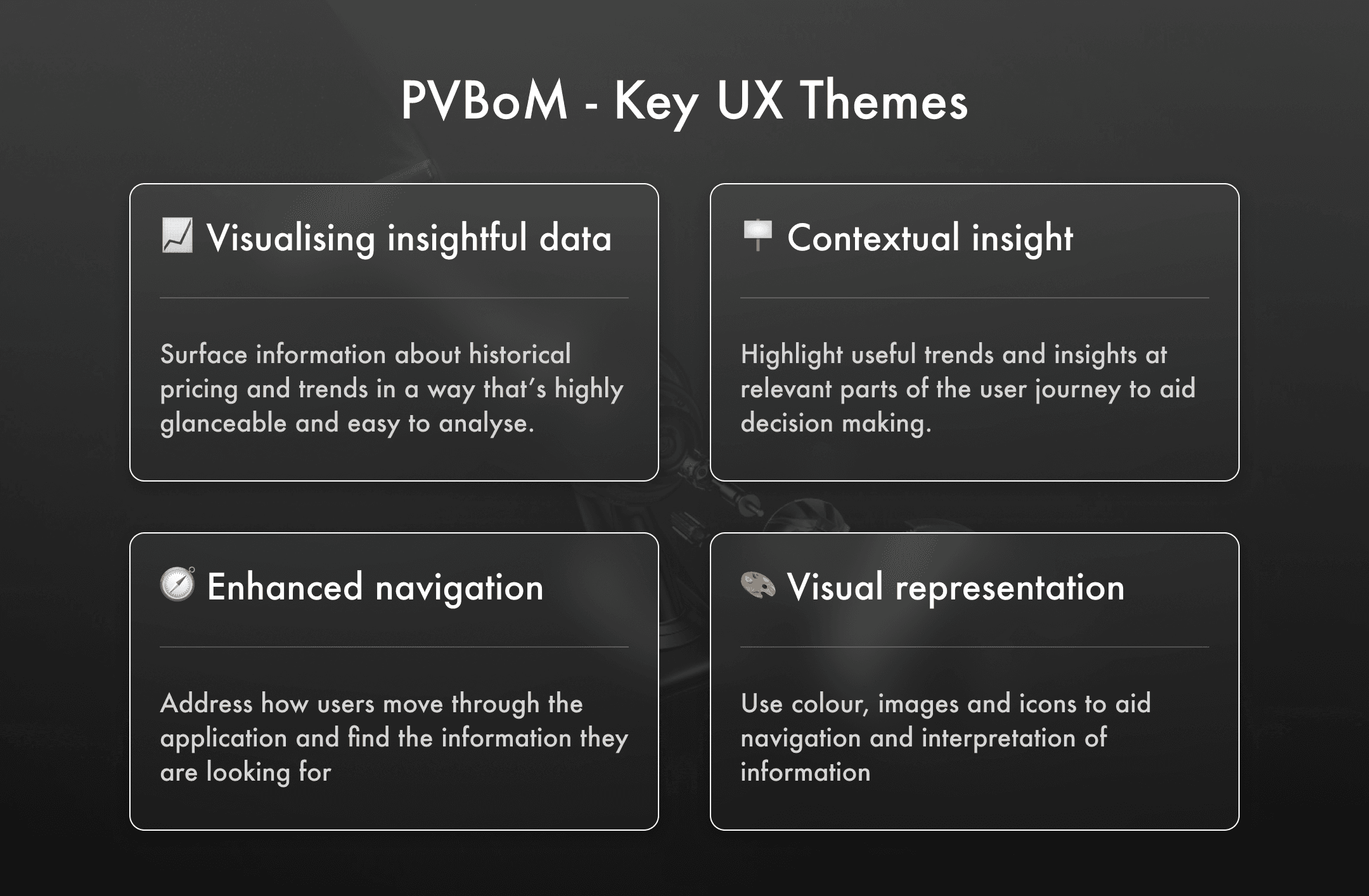
Identified a set of key UX themes with clear rationale and visual examples from existing products to inform design direction
Focused on using lightweight artefacts and prototypes to rapidly iterate and agree design vision with the team
Ran regular weekly design sessions to share progress, gather feedback, and build confidence around discussing UX
Challenge 2 - Data-Dense Interface
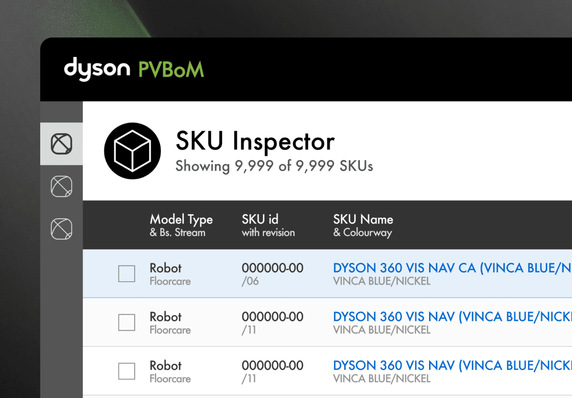
PVBoM’s vast dataset was presented upfront in a single, cluttered view – making simple tasks like comparison or reporting laborious and time consuming. Additionally, the tool felt clunky and confusing when trying to drill down multiple levels into the cost data for a part or SKU.
⛳️ Goal
Make it easier for users to inspect, compare, and identify trends in cost data.
Approach
Spoke to target users to understand how they currently carry out analysis-related tasks and probe the problem space further
Introduced an ‘inspection panel’ to improve focus, reduce cognitive load, and provide a space for relevant insight when drilling down into cost data
Employed greater use of charts, sparklines, and contextual insight markers to make historic trends and patterns more recognisable at a glance
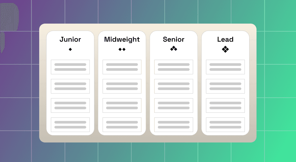
Introduced a new iconography and colour syntax to help differentiate between cost profiles for parts, assemblies and manufacturers

Challenge 3 - Scalability Issues
In its current state the UI would not adapt well to the addition of upcoming features. It also became clear through user interviews that the tool needed to support multiple task-based user journeys – and have the ability to evolve over time as new requirements emerged.
⛳️ Goal
Lay the groundwork for a scalable, task-based interface that can evolve over time
Approach
Prototyped a revised information architecture featuring a sidebar with clearer navigation between different analysis ‘tools’
Added tabbed views in the inspection panel to provide more real estate for modular UI components like charts and tables
Use consistent treatment of product images and iconography as a relevant shorthand to aid navigation in a more visual and intuitive way
Impact
✅ Shaped the Roadmap: Several design ideas – including the inspection panel, data visualisation and improved IA – were slotted into the product roadmap
✅ Built UX Awareness: Focused, weekly design sessions helped the team become more effective at discussing and contributing to UX proposals
✅ Improved Stakeholder Buy-In: Lightweight visuals and prototypes helped the team communicate the vision to senior stakeholders with confidence
Takeaways
Leading with principles and themes worked well for a team with low design maturity. Jumping straight into UI designs without first outlining a clear rationale would have been a mistake
Empowering a team through effective coaching, vision setting, and actionable insight is the best way to leave a lasting strategic influence – even in a very short amount of time