Revamping the entire product experience of a powerful SaaS platform that provides geospatial data to land professionals with a new IA, simplified UI, and more intuitive interaction principles.
LandHawk soft launched in 2019 to feedback that while the quality of their data was good, the overall user experience was poor. I was asked to redesign the platform from the ground up, working closely with a small dev team to implement an enhanced UX in an ambitious 6-month timeframe.
Key Challenges & Solutions
Challenge 1 - Complex GIS Data Sources
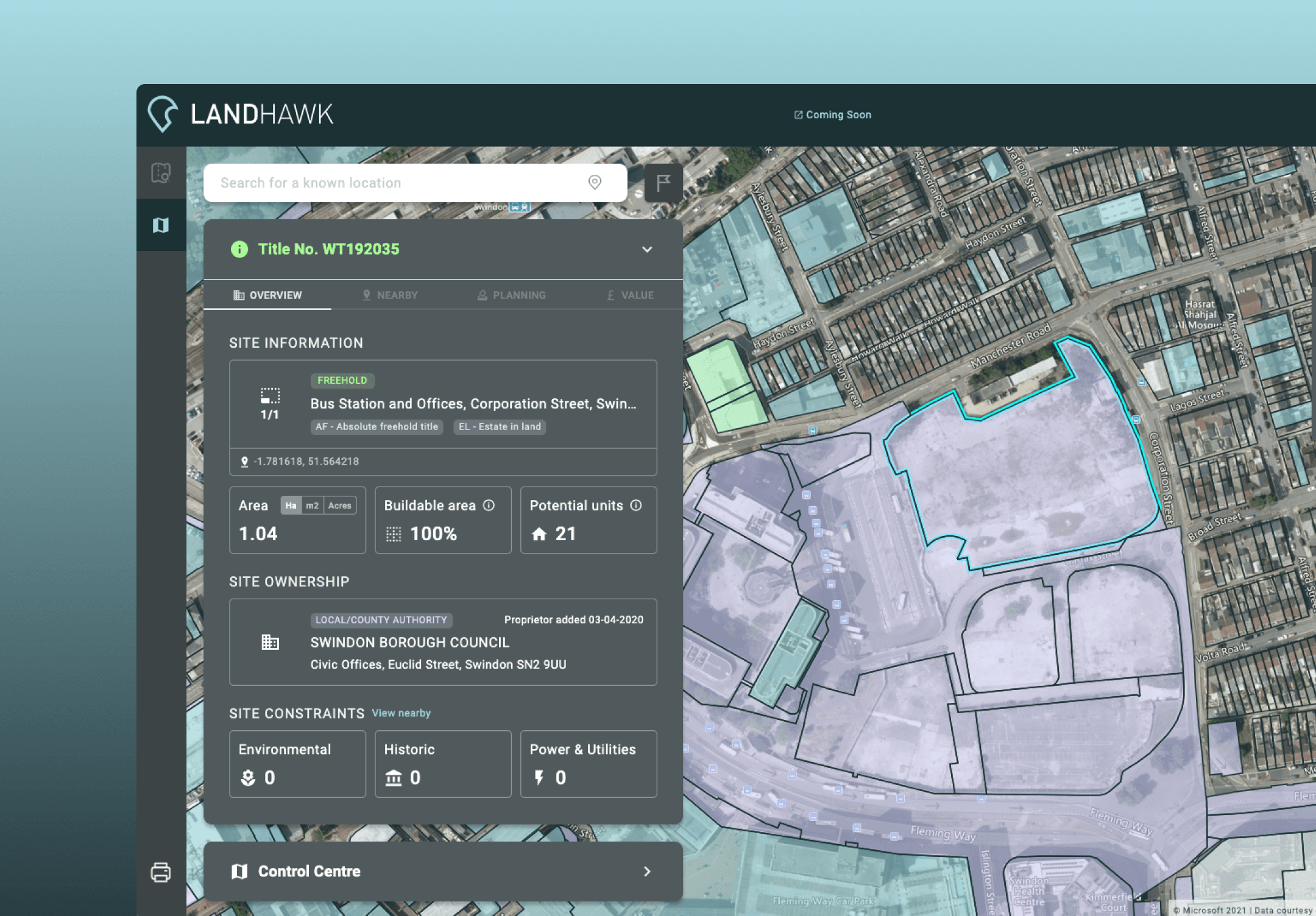
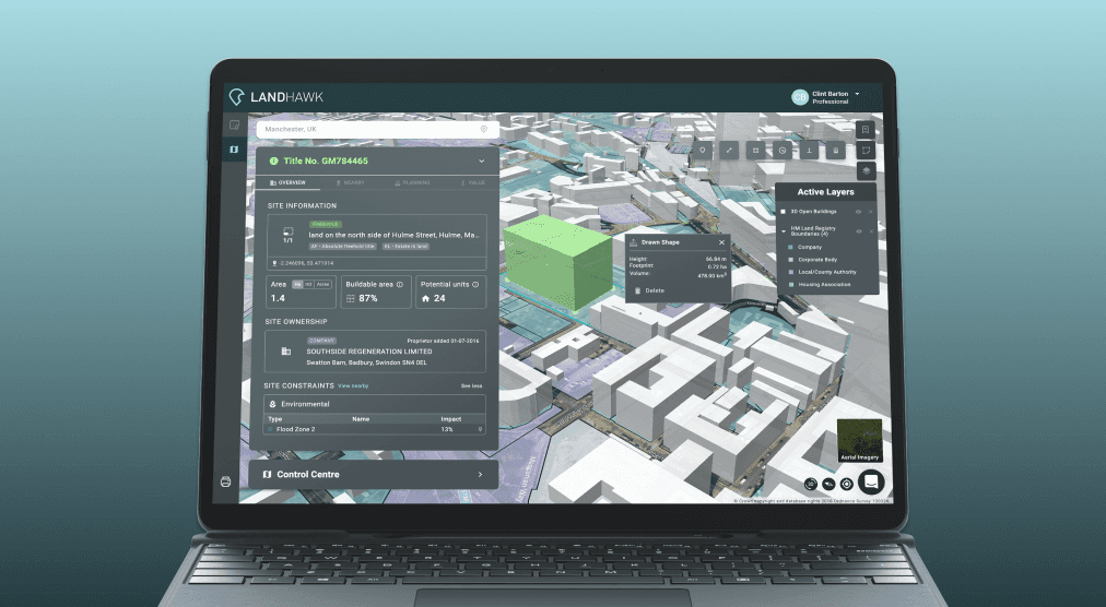
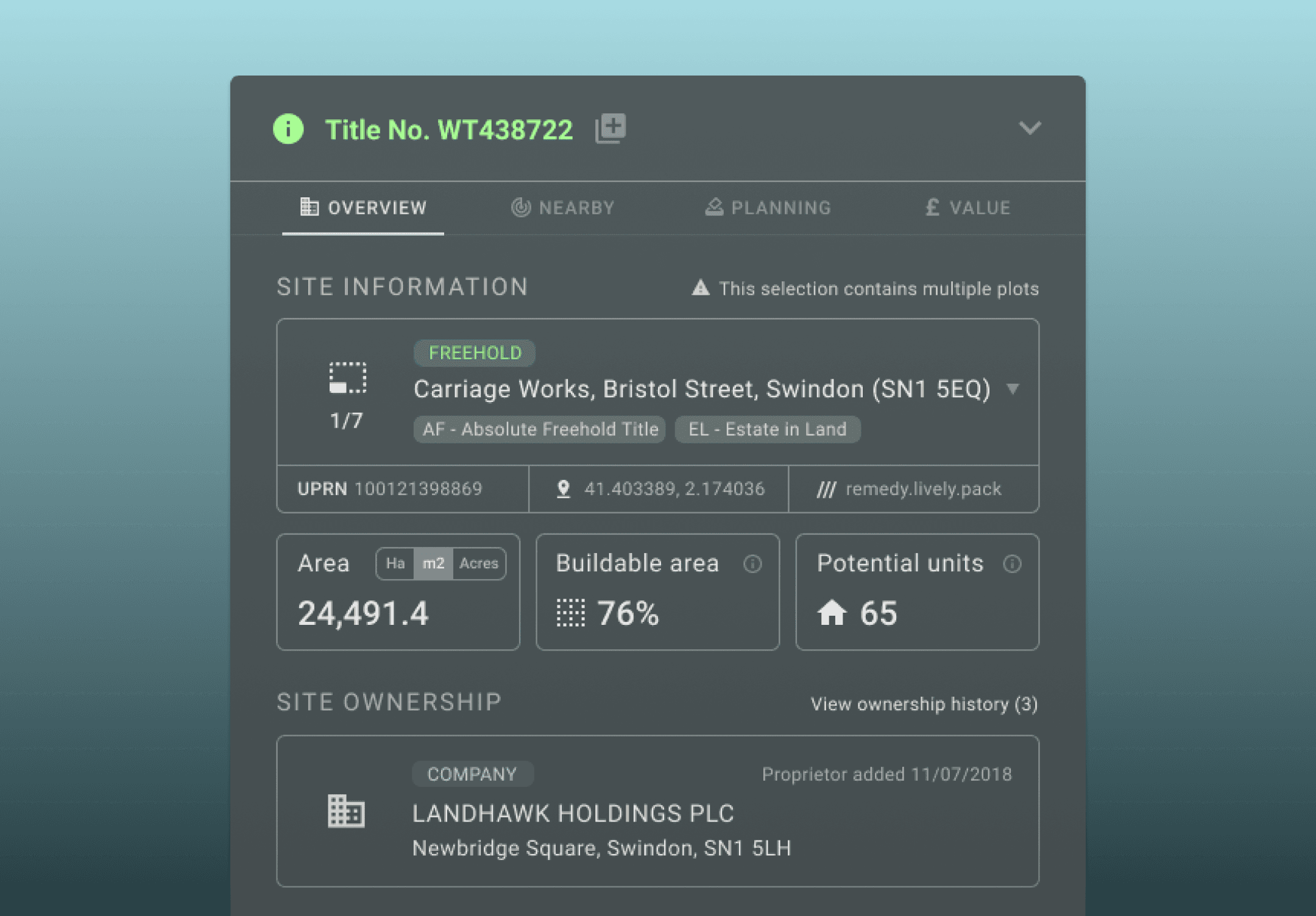
As part of its core offering, LandHawk scrapes hundreds of disparate databases to provide valuable insight for any given land parcel in the UK. Although comprehensive, many users felt the interface was cluttered and overwhelming with too much information to digest easily.
⛳️ Goal
Organise and deliver geospatial insight to users in a simple, intuitive way
Approach
Worked with the Founder and Product Owner to understand key industry use cases and map core user personas
Worked closely with in-house GIS Mapping expert to understand data sources and how we could present them differently
Introduced an ‘Info panel’ to dynamically show information for selected land parcels, with data neatly grouped in sections and tabs
Used modular cards and clear iconography to create a natural visual hierarchy and improve legibility of data points
Challenge 2 - Non-technical User Base
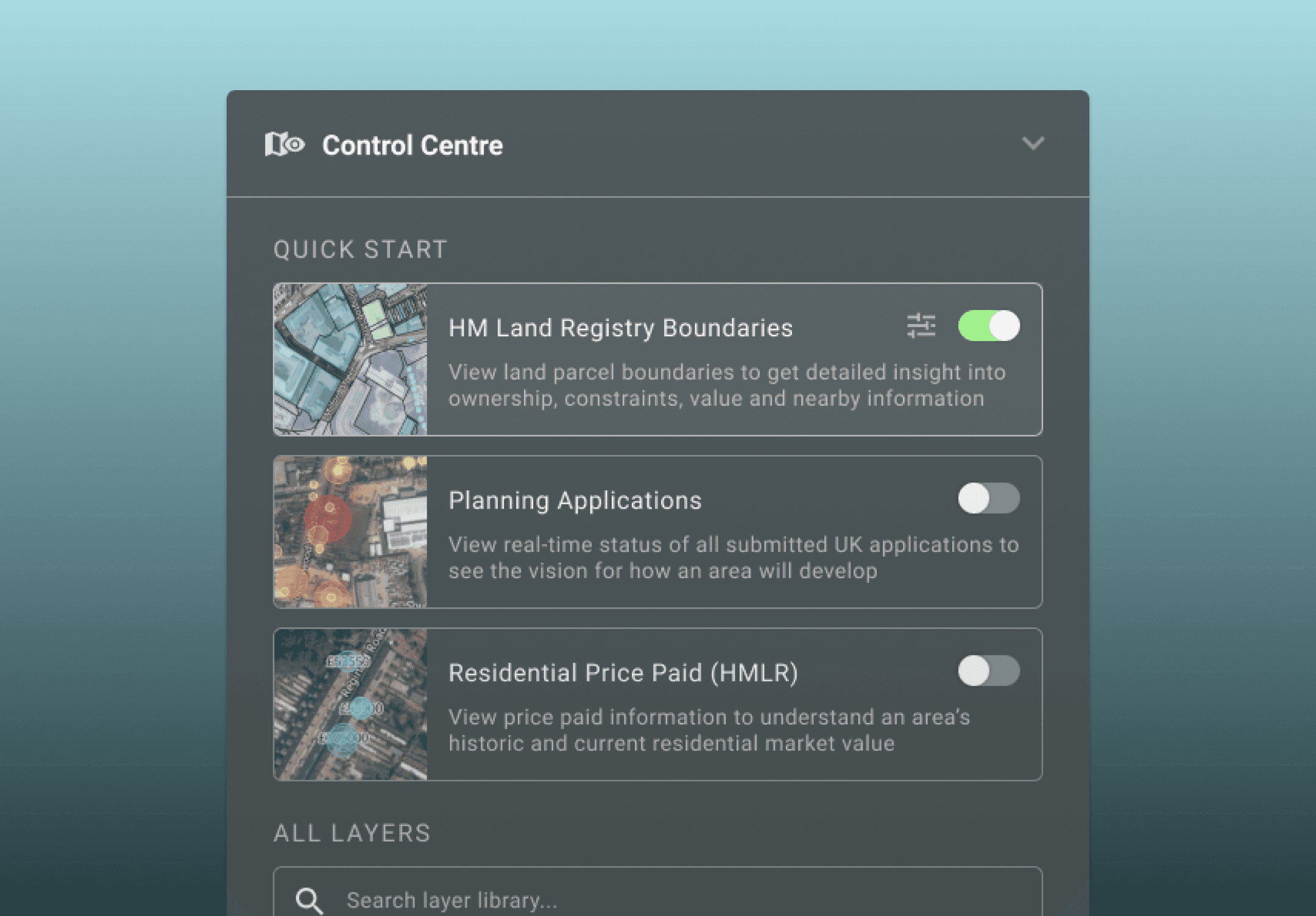
Software is still a recent novelty in the UK planning sector, with many senior planners still relying on traditional methods. When opening the application for the first time many users simply asked “what do I do?” – unaware of the many powerful analysis tools at their disposal.
⛳️ Goal
Accommodate users with varying levels of digital literacy and confidence.
Approach
Gathered feedback from trial users to understand friction points and suggestions for improvement
Observed sales demos by the Founder and Product Owner to understand the key features and entry points for different user types
Designed a simple welcome screen pop-up to onboard and introduce key features to new users, which could be updated over time
Introduced a ‘Quick Start’ section to help returning users get started with their preferred map layer configuration, based on common tasks
Challenge 3 - Bottlenecked Dev Resource
With only 2 developers, a growing backlog, and only 6 months to launch, I needed to find a way to help streamline the delivery process. The prioritisation was clear enough from the Founder and Product Owner, so the more features we could ship the more successful our MVP launch could be.
⛳️ Goal:
Streamline the handover process from feature requirement to delivery
Approach
Spent time with the developers to understand their day-to-day workflow, challenges, and approach to sizing work
Adapted the LandHawk Design System to use Material Design 2 as a basis, allowing greater use of modified ‘off-the-shelf’ UI components and interactions – reducing the need for custom elements
Worked closely with the developers to ensure the Design System styling was configured properly in code, making adding new components quick and easy
Used FigJam to rapidly create wireframes, annotated user flows, and other lightweight artefacts to communicate design vision. Eventually this was enough for the developers to accurately size and being work on features
Used high-fidelity Figma prototypes to ensure a coherent aesthetic with code and ‘tidy up’ any outstanding styling differences

Impact
✅ Increased usability: User feedback showed that features were easier to find and much more intuitive than before
✅ Streamlined handover process: A simplified design system, lightweight design artefacts, and better synergy with the engineering team all helped reduce time from Discovery to Delivery
✅ Springboard for acquisition: LandHawk was acquired in 2022, with the press release citing its outstanding software as one of the key factors of the decision – less than a year after the redesign launch
Takeaways
Spending the time to understand the developer’s key challenges made problem solving a shared goal, ultimately leading to greater trust in my designs - even when complexity was initially challenged
A tight feedback loop with users is critical. The team had done a great job testing the application and gathering feedback. The Founder’s deep understanding of the industry also helped illuminate how we could solve core issues with the redesign.
Having a BETA is a very useful way to test new features as they launch, and gather feedback on the fly